Why Truncated Axes Can Distort Environmental Trends
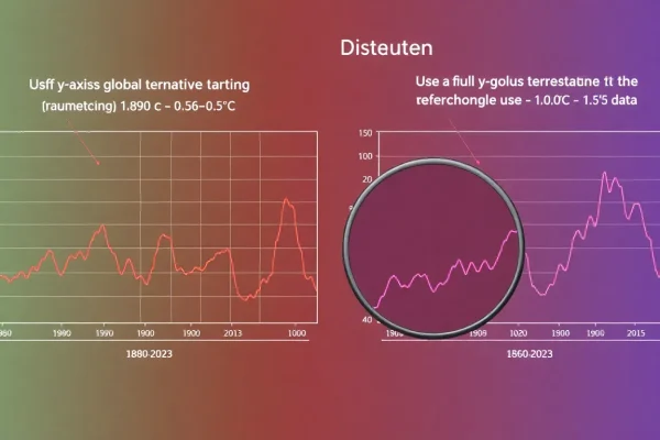
Global average temperature anomaly in 2023 was 1.17°C above the 1951-1980 baseline, according to NASA GISS. Truncating the y-axis on temperature charts can exaggerate…
Topic archive
Charts and graphics that illustrate data trends.
Global average temperature anomaly in 2023 was 1.17°C above the 1951-1980 baseline, according to NASA GISS. Truncating the y-axis on temperature charts can exaggerate…
The global average temperature anomaly for 2024 was 1.28°C above the 1951-1980 baseline, according to NASA GISS. Truncating the y-axis in charts of such…