In brief
At a glance
Quick Facts
- Current figure
- 1.17°C above 1951-1980 baseline
- Measurement date
- Calendar year 2023
- Previous figure
- 0.89°C (2022)
- Change
- +0.28°C (+31.5%)
- Data source
- NASA GISS GISTEMP v4
- Next update
- Mid-January 2025 (for 2024)
Current figure
The global average temperature anomaly for 2023 was 1.17°C above the 1951–1980 baseline, according to NASA’s Goddard Institute for Space Studies (GISS) Surface Temperature Analysis (GISTEMP v4). This value represents the combined land and ocean surface temperature departure from the long-term average.
Measurement date
The figure refers to the full calendar year 2023 (January through December). NASA GISS updates its global temperature record annually, typically releasing the previous year’s data in mid-January. The 2023 value was published on 12 January 2024.
Previous figure
The global average temperature anomaly for 2022 was 0.89°C above the 1951–1980 baseline (NASA GISS). The change from 2022 to 2023 was an increase of 0.28°C, or approximately 31.5% relative to the 2022 anomaly. This jump was partly influenced by the transition from La Niña to El Niño conditions in the Pacific Ocean.
Long-term trend
The long-term global temperature trend shows a clear warming of approximately 0.8°C since 1880, with the rate of warming nearly doubling since 1975. The ten warmest years in the instrumental record have all occurred since 2010. The following table presents annual global temperature anomalies (relative to the 1951–1980 baseline) for selected years, based on NASA GISS data:
| Year | Temperature Anomaly (°C) |
|---|---|
| 2014 | 0.73 |
| 2015 | 0.87 |
| 2016 | 1.00 |
| 2017 | 0.91 |
| 2018 | 0.83 |
| 2019 | 0.95 |
| 2020 | 1.01 |
| 2021 | 0.84 |
| 2022 | 0.89 |
| 2023 | 1.17 |
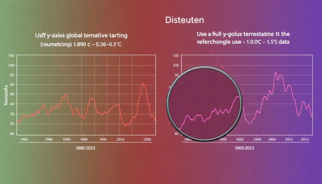
When plotted on a chart with a truncated y-axis (e.g., starting at 0.5°C rather than 0°C or a pre-industrial baseline), the recent warming appears more dramatic, and the long-term context is lost. A full-axis plot reveals that while 2023 was exceptionally warm, the overall trend since the late 19th century is a steady rise, not a sudden spike.
Data source
The primary data source is the NASA Goddard Institute for Space Studies (GISS) Surface Temperature Analysis (GISTEMP v4). This dataset combines land surface air temperatures from the Global Historical Climatology Network (GHCN) with sea surface temperatures from the Extended Reconstructed Sea Surface Temperature (ERSST v5) dataset. The data are publicly available at https://data.giss.nasa.gov/gistemp/.
Methodology
NASA GISS calculates global temperature anomalies by comparing measured temperatures at weather stations and sea surface temperature readings to a baseline period (1951–1980). The anomaly method removes systematic biases such as station location or instrument changes. The global average is computed by weighting temperature anomalies by the area of grid cells, with adjustments for spatial coverage gaps using spatial interpolation. The resulting time series is a widely accepted measure of global climate change.
Why annual values fluctuate
Year-to-year variations in global temperature are primarily driven by internal climate variability, particularly the El Niño–Southern Oscillation (ENSO). El Niño events (warm phase) tend to increase global temperatures, while La Niña events (cool phase) suppress them. Other factors include volcanic eruptions, which can cause short-term cooling, and solar variability. The long-term trend, however, is dominated by increasing greenhouse gas concentrations. Truncating the y-axis can exaggerate these natural fluctuations, making them appear as dramatic spikes or dips rather than noise around a rising trend.
Regional variation
Global temperature anomalies mask significant regional differences. The Arctic, for example, has warmed at roughly twice the global average rate. The table below shows 2023 temperature anomalies by latitude band, relative to the 1951–1980 baseline, based on NASA GISS data:
| Latitude Band | 2023 Anomaly (°C) |
|---|---|
| 90°N–64°N | 2.17 |
| 64°N–24°N | 1.49 |
| 24°N–24°S | 1.01 |
| 24°S–90°S | 0.72 |
When visualizing regional trends, truncated axes can similarly distort the perceived magnitude of warming, especially in high-latitude regions where anomalies are larger.
Meaning and limitations
The global temperature anomaly is a key indicator of climate change, but its visual representation can be manipulated. Truncating the y-axis—starting it at a value higher than zero or the baseline—can make a gradual trend appear as a sudden spike, exaggerating the rate of change. Conversely, truncating the top of the axis can downplay extreme values. In environmental communication, such practices can mislead the public and policymakers. Best practices for accurate visualization include: using a baseline that represents a meaningful reference period (e.g., pre-industrial), showing the full range of data, and clearly labeling axes. The temperature record itself has limitations: spatial coverage is uneven, particularly in polar regions and earlier periods, and the baseline choice affects the anomaly values. Users should always check the axis scales and baseline when interpreting charts.
Next expected update
NASA GISS typically releases the annual global temperature anomaly for the previous year in mid-January. The 2024 full-year figure is expected around 10–15 January 2025. Monthly updates are also available with a lag of approximately two weeks.
Downloadable chart or table
The table below provides annual global temperature anomalies from 2010 to 2023 (NASA GISS). The full dataset can be downloaded from NASA GISTEMP.
| Year | Anomaly (°C) |
|---|---|
| 2010 | 0.70 |
| 2011 | 0.58 |
| 2012 | 0.62 |
| 2013 | 0.64 |
| 2014 | 0.73 |
| 2015 | 0.87 |
| 2016 | 1.00 |
| 2017 | 0.91 |
| 2018 | 0.83 |
| 2019 | 0.95 |
| 2020 | 1.01 |
| 2021 | 0.84 |
| 2022 | 0.89 |
| 2023 | 1.17 |
FAQ
Why do truncated axes distort environmental trends?
Truncated axes remove part of the data range, often starting the y-axis at a value above zero or the baseline. This exaggerates the visual slope of a trend, making small changes appear large. In environmental charts, such as global temperature, truncating the axis can make a gradual warming trend look like a sudden spike, misleading viewers about the rate and magnitude of change.
How can I spot a truncated axis in a chart?
Check the y-axis scale. If it does not start at zero or a meaningful baseline (like a pre-industrial average), it may be truncated. Look for a break in the axis or a non-linear scale. Also, compare the visual slope with the actual data values; a steep line with small numerical changes often indicates truncation.
What are best practices for visualizing environmental trends?
Use a full axis that includes the baseline (e.g., 0°C anomaly or pre-industrial level). Show the entire time series to provide context. Label axes clearly and include uncertainty ranges. Avoid 3D effects and unnecessary decorations. When comparing multiple datasets, use consistent scales.
References
- NASA Goddard Institute for Space Studies (2024). GISS Surface Temperature Analysis (GISTEMP v4). https://data.giss.nasa.gov/gistemp/
- NOAA National Centers for Environmental Information (2024). State of the Climate: Global Climate Report for 2023. https://www.ncei.noaa.gov/access/monitoring/monthly-report/global/2023
- IPCC (2021). Climate Change 2021: The Physical Science Basis. Contribution of Working Group I to the Sixth Assessment Report. Cambridge University Press.
- Hansen, J., R. Ruedy, M. Sato, and K. Lo (2010). Global surface temperature change. Reviews of Geophysics, 48, RG4004.
- Tufte, E. R. (2001). The Visual Display of Quantitative Information. Graphics Press.
